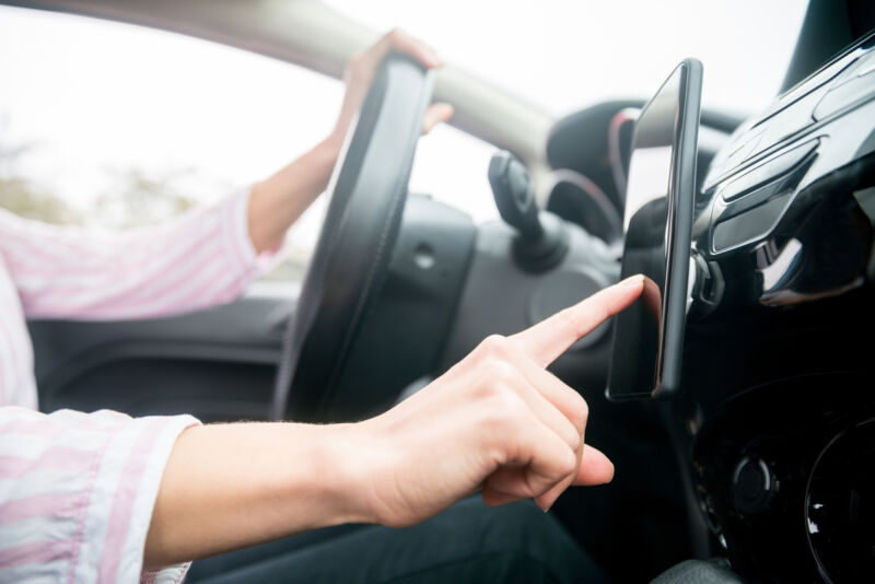
It's probably a little early to be warning of extinction, but in some new cars, buttons are becoming hard to find. Given that a screen has to go into the dashboard anyway (thanks to things like backup camera requirements) and the fact that people increasingly won't consider a car without Android Auto or Apple CarPlay, touchscreens make life easier for automakers in terms of design and assembly.
It's just that they don't make life easier for drivers. Instead, we're treated to bad interfaces that don't create muscle memory but instead distract us while we should be driving. And now, Swedish car publication Vi Bilägare has the data to prove it.
VB tested 11 new cars alongside a 2005 Volvo C70, timing how long it took to perform a list of tasks in each car. These included turning on the seat heater, increasing the cabin temperature, turning on the defroster, adjusting the radio, resetting the trip computer, turning off the screen, and dimming the instruments.
The old Volvo was the clear winner. "The four tasks is handled within ten seconds flat, during which the car is driven 306 meters at 110 km/h [1,004 feet at 68 mph]," VB found. Most of the other cars required twice as long, or more, to complete the same tasks.
VB says that "one important aspect of this test is that the drivers had time to get to know the cars and their infotainment systems before the test started." With my devil's advocate hat on for a second, most drivers who drive regularly will regularly drive the same car, building more familiarity over months and years than a journalist will after even a week with a new model. But that kind of long-term adaptation is the user conforming to the vehicle's wishes, and shouldn't good design be the opposite of that?
Why they pushed the button on all-touch interfaces
VB lays the blame for the shift from bottons to screens with designers who "want a 'clean' interior with minimal switchgear." That's fair, but I don't think we can count out the accountants either. If everything can be achieved by touching the screen, then the company doesn't also have to pay for the plastic and wires that buttons are made from, nor the time it takes someone to make that into buttons or install them in a car.
Even with touchscreens, though, we can see in the spread of scores VB gave to different all-touch cars that design matters. You'll find almost no buttons in a Tesla Model 3, and we called out the lack of buttons in the Subaru Outback in our review, but both performed quite well in VB's tests. And VW's use of capacitive touch (versus physical) for the controls on the center stack appears to be exactly the wrong decision in terms of usability, with the ID.3 right at the bottom of the pack in VB's scores.
I'm not surprised that the BMW iX scored well; although it has a touchscreen, you're not obligated to use it. BMW's rotary iDrive controller falls naturally to hand, and there are permanent controls arrayed around it under a sliver of wood that both looks and feels interesting. It's an early implementation of what the company calls shy tech, and it's a design trend I am very much looking forward to seeing evolve in the future.
Again, there are examples of automakers doing this better than others. Over the past couple of weeks I've spent time in an Acura MDX and Mazda CX-50, neither of which uses a touchscreen infotainment system. Neither managed to do better than 19 mpg either, which is frankly appalling in 2022, but the CX-50 did at least distinguish itself for ease of use when it came to the infotainment system.
Mazda's latest system has been criticized for being bare-bones, but odds are, a driver is using Apple CarPlay or Android Auto, and it's actually quite easy to use with the rotary controller and its hard buttons, which, again, are right where your right hand expects them to be (or left hand, in a right-hand-drive car).
-
Managing Editor Eric Bangeman wished for actual physical climate controls when he tested the Subaru Outback, but it performed well in VB's tests.Eric Bangeman
-
The Tesla Model 3 interior is the most extreme example of button-deletion, but it did not perform badly in VB's tests.Jonathan Gitlin
-
The Volvo C40 has a few more buttons than a Model 3, but was edged in VB's testing.Jonathan Gitlin
-
Volkswagen's infotainment software in the ID.3 can be frustratingly laggy, and while there are permanent controls for the climate and audio, they're capacitive touch, not real buttons or dials or knobs.Volkswagen
-
BMW's rotary controller also integrates a trackpad and is a great way to interact with the iDrive system. It also features great voice recognition.BMW
-
Mazda's infotainment controller is simple but highly functional and easy to use.Mazda
-
The True Touchpad in the Acura MDX might get easier to use with familiarity, but after a week I was still very frustrated with it.Acura
The more expensive Acura also places the infotainment screen far out of reach. It's a much higher-resolution display befitting a much more expensive car, and the MDX's infotainment system is much more capable than the CX-50's in terms of apps and features. I also quite like the layout and fonts, although obviously that's a pretty subjective thing.
I won't subject you to the depth of my current feelings about Acura's "true touchpad," just a high-level, mostly polite version. It has a 1:1 relationship between the screen and the pad, so it doesn't work at all like any other trackpad in any other car you might have driven. And that means it requires a lot of concentration to use, particularly if you're trying to interact with CarPlay. And it doesn't need saying that "requires concentration to use" is likely the last quality anyone wants in an infotainment system.
I'm not that surprised that the old Volvo won, dating from a time when most functions were controlled by individual buttons and when infotainment didn't really yet exist. And in some ways, the tests played to its strengths—there's no Android Auto or CarPlay, and the only safe way your phone is showing you directions is if you bring a suction mount. Do be careful what you press if anyone's sitting in the back seat, though. In Volvos of that vintage, one of those buttons drops the rear headrests, which are rather heavy and very much wish to return to a horizontal orientation with absolute disregard for the skulls of anyone sitting in their way.
reader comments
388